Lifecycle Charts: See Which Stage Is Eating Your Incident Time

Everyone on the team remembers it as the four-hour incident. It still comes up in planning months later whenever someone wants to describe a bad night, and nobody has ever questioned the number, because the number is correct.
The team recorded the official timeline as:
- 22:14: the alert fires and the incident opens
- 23:44: someone finally claims it, ninety minutes later, because it had been routing to a rotation that quietly lost its owner two sprints ago when a teammate moved squads and nobody updated the schedule
- 00:15: the cause is identified as a connection pool setting
- 00:26: the fix ships and the error rate falls almost immediately, eleven minutes of actual work
- 02:11: the incident closes, after nearly two hours of refreshing dashboards and asking each other whether it was safe to call it, because nobody could say with confidence why that setting had been wrong in the first place
Three separate problems showed up that night. An on-call rotation had no owner, so an alert went unacknowledged for an hour and a half. No one understood why the connection pool had been misconfigured, so no one could confidently say the incident was truly resolved. Yet the review focused almost entirely on the technical issue, even though it was the easiest of the three problems to fix.
They had the timeline in front of them and still reached the wrong conclusion, which happens more often than you'd think. No one in the room knew whether taking ninety minutes to claim an alert was unusual or normal for this team, or whether spending two hours watching dashboards after a fix was standard practice. Answering either question would have meant reviewing every incident from the previous six months, and nobody had time for that.
That is the hidden cost of a single MTTR number. The total may be accurate, but the story people tell from it often isn't, because all the detail has already been flattened away. Four hours doesn't tell you whether your team was slow to detect the problem, reach the right person, understand what was happening, or gain confidence that the fix had actually worked.
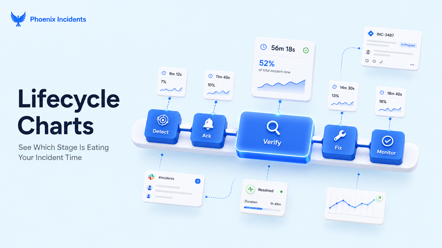
That is why we built Lifecycle Charts. They break MTTR into five stages, Detect, Ack, Verify, Fix and Monitor, and report the spread across each one rather than a single average, without leaving Jira.
Before getting to how it works, let’s explain what the one MTTR number is hiding.
The Problem With Looking at MTTR as One Number
None of this means MTTR is useless. It's a useful headline metric, easy to explain to people outside engineering, and Atlassian incident metric guide rightly includes it as one of the standard ways to measure incident response. The problem is when it becomes the only number in the room, because then, it's expected to answer questions it was never designed to answer.
Example: Two teams with the same MTTR, but two different problems
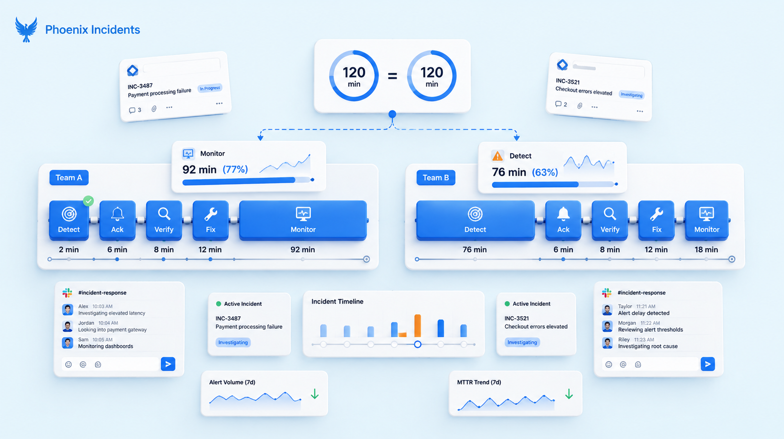
Take two teams. Both columns below add up to exactly the same total, but they have almost nothing else in common.
| Stage | Team A | Team B |
|---|---|---|
| Detect | 4 mins | 71 mins |
| Acknowledge | 6 mins | 12 mins |
| Verify | 22 mins | 9 mins |
| Fix | 18 mins | 14 mins |
| Monitor | 70 mins | 14 mins |
| Total | 120 mins | 120 mins |
Both teams report a two-hour MTTR, so if that's all leadership sees, they'll likely receive the same feedback and improvement targets. But once you break down the numbers, it becomes clear that they're facing very different problems.
Team A detects failures almost immediately but spends too long confirming that the fix has actually worked, often a sign that the root cause wasn't fully understood.
Team B understands its systems well and responds quickly once an incident is identified, but loses more than an hour before anyone even notices there's an incident.
The breakdown shows Team B's longer MTTR is really a monitoring and alerting problem, not a response problem. Telling them to respond faster focuses on the one thing they already do well, while the issue actually driving the delay is never addressed. That's the trap of relying on a single metric.
Averages Hide The Incidents You Should Be Worried About
There's a second problem beneath the first: the arithmetic mean is a poor way to summarize incident data. Research discussed by Courtney Nash found that incident durations are positively skewed. Most incidents are resolved quickly, while a small number of long-running incidents pull the average upward.
Štěpán Davidovič showed through Monte Carlo simulation that genuine improvements in incident duration don't always produce a meaningful change in MTTR. The metric can rise or fall even when nothing has changed, or stay flat when performance has improved.
John Allspaw calls this kind of summary "shallow incident data" because it makes messy systems look neat and easy to report.
The research isn't saying to replace the mean with the median metrics; it just goes a step further to recommend that teams move beyond MTTx metrics altogether in favor of service level objectives (SLOs) or measures of coordination cost. Both are valuable, but they answer different questions.
An SLO tells you whether you are meeting a reliability target, and on the occasions you miss it, you still have to work out where the time actually went. Coordination cost tells you what an incident took out of the organisation, how many people it pulled in and from how many teams, which is important to know but still says nothing about which stage was slow.
That's what Lifecycle Charts show, helping you identify the incidents that deserve the deeper investigation the research is really calling for.
What it Takes to Measure Every Stage in Jira On Your Own
The idea of breaking down MTTR isn't new or controversial. New Relic recommends measuring each stage of the incident lifecycle separately and building dashboards that show median and percentile values by stage, severity, and service.
Better Stack makes the same point, arguing that a single MTTR figure can't tell you whether the delay came from slow detection, slow response, or the repair itself.
Across the industry, there's broad agreement on what teams should be measuring. But almost nobody tells you what it takes to actually do it on Jira.
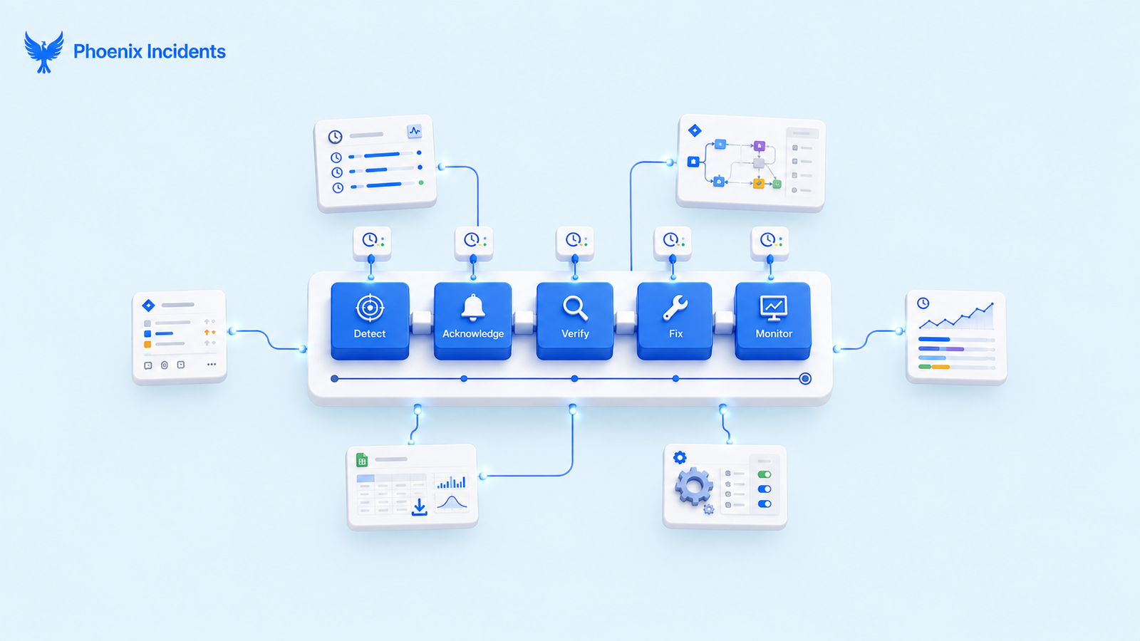
In practice the work looks like this:
- Five timestamps captured consistently on every single incident, by every responder, including the ones responding at three in the morning
- Workflow statuses modelled so that the transitions actually correspond to the stages you want to measure
- A status duration app or a custom gadget to turn Jira's transition history into usable durations
- Percentile calculation, which almost always means exporting the data somewhere it can be calculated
- Someone owning the whole arrangement and repairing it every time the workflow changes
This isn't a hypothetical problem. A developer productivity analysis by DX points out that Jira doesn't break MTTR down into individual lifecycle stages out of the box, it leaves teams with a high-level metric that hides where engineers are actually losing time.
Look through the Atlassian Community forums and you'll find the same answer repeated: use a third-party status duration app, export the data as a CSV, and analyze it in Excel.
The Spreadsheet Tax
That export step sounds minor, but it creates bigger problems than it seems. By the time a post-incident review begins, the data is often already days out of date, so the discussion is based on a snapshot instead of the latest picture.
One person usually becomes the only one who knows how to generate the report, and the analysis stops whenever they're unavailable. And because producing the report takes effort, teams only do it for major incidents but skip the smaller ones, allowing gradual trends across everyday incidents to go unnoticed.
All of these options work. They just come with different costs:
| Approach | What it gives you | What it costs |
|---|---|---|
| Jira's built-in status gadget | Average time per status, calculated across resolved issues | Admin setup and a dedicated custom field before it returns anything, averages only, and it reports on workflow statuses rather than incident stages |
| Status duration apps from the Marketplace | Time in each status, with medians and percentiles occasionally available | A second app to license, and statuses that have to be mapped to your incident stages and maintained there |
| Lifecycle Charts in Phoenix | Stage medians and distributions, split by product, month over month | Measurement starts when you install Phoenix Incidents |
The middle option is important because those apps do their job well. The difference is just what they're measuring.
A status duration app reports on the statuses in your workflow, so someone has to map those statuses to stages like Detect, Ack, Verify, Fix and Monitor, keep that mapping up to date as the workflow evolves, and remember it whenever they read a report.
Lifecycle Charts measure those stages directly, so there's no mapping to maintain and nothing to translate.
The Five Stages of Incident Lifecycle Phoenix Measures
Lifecycle charts break every incident into five stages and report each one separately. If two people stop the clock at different moments, the chart ends up measuring the difference between them rather than anything about the incident, which is why each boundary below is fixed.
| Stage | Clock starts | Clock stops | A long one usually means |
|---|---|---|---|
| Detect | The problem begins affecting the system | The incident is opened | Monitoring gaps, alert thresholds set too loosely, customers telling you first |
| Acknowledge | The incident is opened | A responder takes ownership | Routing and rotation problems, unclear ownership of a service |
| Verify | Ownership is taken | Scope and cause are confirmed | Thin observability, unfamiliar service, missing or outdated runbooks |
| Fix | The cause is confirmed | Mitigation is applied | Deploy and rollback constraints, change approval delays |
| Monitor | Mitigation is applied | The incident is confirmed stable | Low confidence in the fix, no agreed exit criteria |
Why the “Monitor” Stage is Missing From Most Jira Workflows
Look at the workflow your incidents actually move through in Jira. There’s very likely a state for ‘work in progress’ and a state for ‘done’, and nothing at all representing the stretch between shipping a fix and trusting it.
So the incident gets marked resolved the moment the deploy goes out, and the hour your team then spends watching graphs never becomes data. It’s real-time, your engineers are spending it, but it disappears because the ticket had already moved on without them.
Phoenix treats monitoring as a genuine workflow stage rather than an informal pause before closing, so that period becomes measurable. It also tends to be the most revealing of the five stages.
A team that consistently spends an hour in Monitor is telling you something honest about how well it understood the problem, because teams that know what broke and why don’t need to sit and watch graphs for very long.
Long Monitor times usually trace back to a weak Verify stage, which is exactly the kind of connection a single MTTR figure can never surface.
Why We Show Distributions Instead of Just Averages
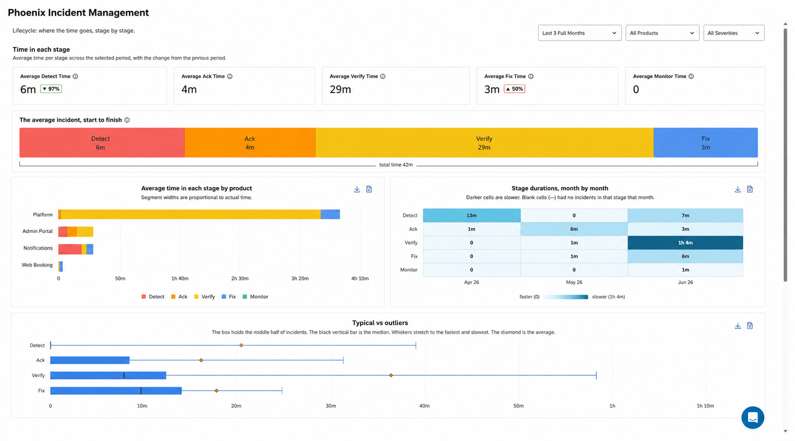
Each stage is shown as a distribution instead of a single number, which lets you ask better questions. The median shows what a typical incident looks like, while the 90th percentile shows what happens on the incidents that go badly.
- Median Verify shows how long it typically takes your team to understand and verify a problem in a familiar service.
- p90 Verify shows how long verification takes on the hardest incidents, when the failure is unfamiliar or the on-call engineer lacks experience with that system.
- The gap between them shows how consistent your response is. A small gap means the team handles unfamiliar problems almost as well as familiar ones. A large gap means fast responses depend heavily on who happens to be on call, pointing to a very different problem to solve.
Split By Product, Tracked Month Over Month
The same data is available by product and over time, giving you two insights a single organisation-wide MTTR can never provide.
The first is identifying which service is holding everything else back. An overall metric can easily hide one poorly monitored system behind nine healthy ones. Breaking the data down by product makes those outliers obvious.
The second is seeing whether your improvements actually worked. If you rewrote a service's runbooks last quarter to reduce MTTR, the month-over-month trend for its Verify stage will show whether the change made a difference. That's the difference between reporting a metric to leadership and measuring the impact of your own improvements.
What Your Lifecycle Chart Is Telling You to Fix First
Most of the value shows up in a handful of recognisable shapes. The team from the opening of this post had two of them in a single night, which is more common than it sounds, and neither one was visible in the four hour figure they carried away from it.
1. Long Detect
If your charts show a long detect time, it means your systems are not telling you when something breaks, so customers are. This is one of the most commonly misdiagnosed delays because it looks like slow incident response when it's actually slow detection. If Detect is consistently your longest stage, responding faster won't improve MTTR because the clock has already been running before anyone knew there was a problem.
Solution:
Start with the services where Detect takes the longest and ask whether your monitoring and alerting cover the failures that keep occurring.
2. Long Acknowledgement
If your charts show a long Ack, it means the problem was easy and reaching the right person was not. When Ack is your bottleneck and Fix is short, your team already knows how to solve these incidents but isn't getting to them quickly enough.
Solution:
Check that on-call rotations have active owners, escalation policies trigger quickly enough, and alerts reach someone who's actually available at that hour.
This is usually an operational issue rather than a technical one, which is good news because it's often straightforward to fix once you've identified it.
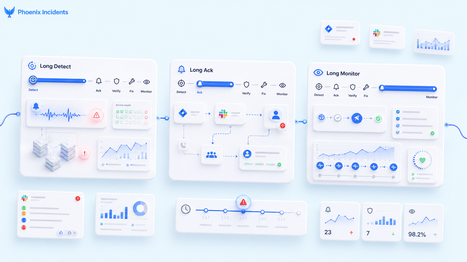
3. Long Monitor
A long Monitor stage usually means the team doesn't trust the fix, and that's often the most valuable signal of all. Teams stay in monitoring when they're not confident the change addressed the real cause, and that uncertainty is useful diagnostic information.
Solution:
Start by asking whether your incidents have clear exit criteria, because many teams have never defined what "stable" actually means and end up watching until someone decides it's probably fine.
Then compare it with the Verify stage for the same service, since long Monitor and long Verify often go hand in hand.
This is exactly what happened during the four-hour incident from the beginning. The team couldn't explain why the connection pool had been misconfigured, so they had no clear way to decide when monitoring could end.
As a result, nearly half the incident was spent in a stage nobody was measuring. One incident like that is a bad night, but twelve over the course of a quarter is a pattern that deserves a roadmap item, and the only way to spot that pattern is to have been measuring it.
All Of it Inside Jira
Lifecycle Charts live alongside the incidents they describe. There's no data to export and no second tool to open before a review begins, so everyone is working from current data instead of a report that was exported days earlier.
The same principle runs through the rest of Phoenix. It coordinates everything that happens after an alert fires across Jira, Slack, and your paging tool, using the tools your engineers already work in instead of sending them to a separate incident platform before they return to Jira.
Analytics that require an export create the same kind of problem because as soon as the data lives somewhere else, reviewing it becomes a separate task instead of part of the team's normal workflow.
Your First Lifecycle Chart Starts Today
One important thing to know before you install Phoenix: Lifecycle Charts start collecting data from the moment they're enabled. They don't reconstruct your past incident history, so meaningful medians and distributions only emerge after you've accumulated enough new incidents to reveal reliable patterns.
So it’s better to start sooner rather than later. Every week you wait is a week of stage-level data you can never recover, and the teams that benefit most are usually the ones that started collecting it before they had a specific question they needed answered.
Install Phoenix Incidents from the Atlassian Marketplace or book a demo to see how well it works on Jira and your first lifecycle chart starts building with your next incident.
Free to try, and it runs inside the Jira projects you already have, so there is nothing new for your team to learn.
Frequently Asked Questions
1. What is a lifecycle chart for incident management?
A lifecycle chart shows how much time an incident spends in each response stage. It can reveal delays in detection, triage, fixing, review, or closure. Teams use it to find the stage that consumes the most time.
2. How can a lifecycle chart show which incident stage is too slow?
It compares the time between key events, such as alert creation, assignment, resolution, and closure. The longest stage points to where work is waiting or getting stuck. Check several incidents before changing your process.
3. Which incident stages should a lifecycle chart track?
Track the stages your team can measure with reliable time stamps. Common stages include detection, acknowledgment, triage, assignment, mitigation, resolution, and review. Keep the chart simple enough that people will maintain it.
4. Do small teams really need lifecycle charts?
Small teams may not need a detailed chart, but a basic view can still expose repeat delays. Start with a few major stages and review the pattern after several incidents. Skip the chart if your records lack clear time stamps.
5. How much does it cost to create a lifecycle chart?
The cost can range from nearly nothing to a larger software or reporting project. A simple chart can use data from an incident tool and a spreadsheet, while automated reports may need engineering work. The main cost is keeping event times accurate and stage names consistent.
6.What are the common mistakes with incident lifecycle charts?
The most common mistake is treating every delay as a team performance problem. Missing time stamps, unclear stage rules, and mixed incident types can make the results misleading. Separate waiting time from active work, then review the chart with the people who handled the incidents.
7. What should we do after finding a slow incident stage?
Confirm the cause by reviewing a sample of incidents from that stage. Then remove one clear blocker, such as unclear ownership, slow approval, or missing runbook steps. Track the chart again to see whether the change reduced the delay.